concept developing, graphic design, art direction, logo font design, visual communication, infographics, data visualization, art direction of the book edition
What is To Remember (Що таке пам'ятати)
concept developing, graphic design, art direction, logo font design, visual communication, infographics, data visualization, art direction of the book edition
Project Overview
This project is a comprehensive cross-disciplinary study and an in-depth analysis of policy and existing practices of honoring the fallen soldiers of the Russo-Ukrainian war in Eastern Ukraine.
This project won the Red Dot Best of the Best award in thebranding category. This project was also awarded by the Art Directors Club of Europe in the Print & Outdoor category (silver) and in the Graphic Communication category (bronze).
My Contributions
I have worked on this project as an art director and design lead, as well as a font and graphic designer.
I conducted research and developed the project concept, created the logotype, graphic elements, design system, infographics, data visualization and marketing materials.
concept developing, graphic design, art direction, logo font design, visual communication, infographics, data visualization, art direction of the book edition
What is To Remember (Що таке пам'ятати)
concept developing, graphic design, art direction, logo font design, visual communication, infographics, data visualization, art direction of the book edition
Project Overview
My Contributions
This project is a comprehensive cross-disciplinary study and an in-depth analysis of policy and existing practices of honoring the fallen soldiers of the Russo-Ukrainian war in Eastern Ukraine.
This project won the Red Dot Best of the Best award in thebranding category. This project was also awarded by the Art Directors Club of Europe in the Print & Outdoor category (silver) and in the Graphic Communication category (bronze)
I have worked on this project as an art director and design lead, as well as a font and graphic designer.
I conducted research and developed the project concept, created the logotype, graphic elements, design system, infographics, data visualization and marketing materials.
It is impossible to talk about the war in one's own country without emotions. It is hard not to see behind the dry numbers the lives of thousands of people. However, the aim of the project is first and foremost a deep analysis and study of the complex present for the sake of a better future.
Therefore, my goal as a creator of visual communication was not only to show the memory emotionally, but also to rationalize it, to go beyond the painful personal and collective experience.
The project included a series of panel discussions and a book containing statistics on those who died in the war. Therefore, an important part of the design system had to be infographics.
The official symbol of the Day of Remembrance of the Defenders of Ukraine, which had to be visualized in the identity, is a sunflower. This popular crop in the east of our country always ripens in late August. But since 2014, the harvest time has been terrible: flowers burnt in the fields, hundreds of dead. A sunflower burnt by a brutal war and still reaching for the sun is a beautiful metaphor. In my opinion, it carries the necessary charge – we must survive, but not lose our identity. That is why its visual embodiment should be clean, clear, devoid of unnecessary decorative elements that distract from the main point.
The second important insight that influenced the conceptual decision when developing the identity was people's fatigue with the Soviet tradition of sacralizing some Unknown Soldier. He is not a person, but only a part of the myth of the Great Invincible Empire. And this is not surprising, because such a fighter is objective, impersonal, and difficult to feel empathy for. Whereas our real, heaviest losses are specific people, individuals, and each of them was an important part of the community. So, as a creator of visual communication, I was looking for a way to show everyone in our design system. Nature and mathematics helped us find a solution, namely the Fermat spiral pattern. It is widespread in natural formations and, in particular, underlies the structure of the sunflower's kernel.
Task and Solution
Moodboard
The memory of our species is short-lived. Over time, details are generalized and memories of trauma are erased. At the level of the individual, this is a blessing given to us by evolution. However, collective, social memory should not neglect anything. After all, it is in the details that the most important things for understanding and analyzing the past often lie.
Therefore, the lettering for the project's logo reflects that we as individuals tend to forget what we should remember as a nation. The letters are generalized, devoid of details. So the meanings remained recognizable, but not complete. Our urgent need is to fill in these gaps through the practices of commemorating the dead and open public dialog.
Logo Lettering
Task and Solution
It is impossible to talk about the war in one's own country without emotions. It is hard not to see behind the dry numbers the lives of thousands of people. However, the aim of the project is first and foremost a deep analysis and study of the complex present for the sake of a better future.
Therefore, my goal as a creator of visual communication was not only to show the memory emotionally, but also to rationalize it, to go beyond the painful personal and collective experience.
The project included a series of panel discussions and a book containing statistics on those who died in the war. Therefore, an important part of the design system had to be infographics.
The official symbol of the Day of Remembrance of the Defenders of Ukraine, which had to be visualized in the identity, is a sunflower. This popular crop in the east of our country always ripens in late August. But since 2014, the harvest time has been terrible: flowers burnt in the fields, hundreds of dead. A sunflower burnt by a brutal war and still reaching for the sun is a beautiful metaphor. In my opinion, it carries the necessary charge – we must survive, but not lose our identity. That is why its visual embodiment should be clean, clear, devoid of unnecessary decorative elements that distract from the main point.
The second important insight that influenced the conceptual decision when developing the identity was people's fatigue with the Soviet tradition of sacralizing some Unknown Soldier. He is not a person, but only a part of the myth of the Great Invincible Empire. And this is not surprising, because such a fighter is objective, impersonal, and difficult to feel empathy for. Whereas our real, heaviest losses are specific people, individuals, and each of them was an important part of the community. So, as a creator of visual communication, I was looking for a way to show everyone in our design system. Nature and mathematics helped us find a solution, namely the Fermat spiral pattern. It is widespread in natural formations and, in particular, underlies the structure of the sunflower's kernel.
Task and Solution
It is impossible to talk about the war in one's own country without emotions. It is hard not to see behind the dry numbers the lives of thousands of people. However, the aim of the project is first and foremost a deep analysis and study of the complex present for the sake of a better future.
Therefore, my goal as a creator of visual communication was not only to show the memory emotionally, but also to rationalize it, to go beyond the painful personal and collective experience.
The project included a series of panel discussions and a book containing statistics on those who died in the war. Therefore, an important part of the design system had to be infographics.
The official symbol of the Day of Remembrance of the Defenders of Ukraine, which had to be visualized in the identity, is a sunflower. This popular crop in the east of our country always ripens in late August. But since 2014, the harvest time has been terrible: flowers burnt in the fields, hundreds of dead. A sunflower burnt by a brutal war and still reaching for the sun is a beautiful metaphor. In my opinion, it carries the necessary charge – we must survive, but not lose our identity. That is why its visual embodiment should be clean, clear, devoid of unnecessary decorative elements that distract from the main point.
The second important insight that influenced the conceptual decision when developing the identity was people's fatigue with the Soviet tradition of sacralizing some Unknown Soldier. He is not a person, but only a part of the myth of the Great Invincible Empire. And this is not surprising, because such a fighter is objective, impersonal, and difficult to feel empathy for. Whereas our real, heaviest losses are specific people, individuals, and each of them was an important part of the community. So, as a creator of visual communication, I was looking for a way to show everyone in our design system. Nature and mathematics helped us find a solution, namely the Fermat spiral pattern. It is widespread in natural formations and, in particular, underlies the structure of the sunflower's kernel.
Moodboard
Moodboard
Logo Lettering
The memory of our species is short-lived. Over time, details are generalized and memories of trauma are erased. At the level of the individual, this is a blessing given to us by evolution. However, collective, social memory should not neglect anything. After all, it is in the details that the most important things for understanding and analyzing the past often lie.
Therefore, the lettering for the project's logo reflects that we as individuals tend to forget what we should remember as a nation. The letters are generalized, devoid of details. So the meanings remained recognizable, but not complete. Our urgent need is to fill in these gaps through the practices of commemorating the dead and open public dialog.
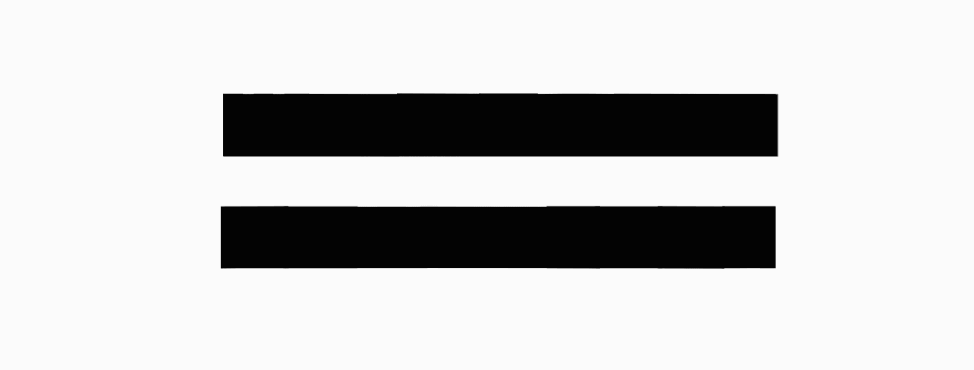
Logo lettering
The memory of our species is short-lived. Over time, details are generalized and memories of trauma are erased. At the level of the individual, this is a blessing given to us by evolution. However, collective, social memory should not neglect anything. After all, it is in the details that the most important things for understanding and analyzing the past often lie.
Therefore, the lettering for the project's logo reflects that we as individuals tend to forget what we should remember as a nation. The letters are generalized, devoid of details. So the meanings remained recognizable, but not complete. Our urgent need is to fill in thesegaps through the practices of commemorating the dead and open public dialog.
Graphic system
To comprehensively solve the client's tasks, it was necessary to create a design system aimed primarily at visualizing data on the victims of the Ukrainian-Russian war.
Using a computer model of phyllotaxis, we generated several sunflower cores with a different number of seed points according to the number of death over the years and months of the war.
We used this system in the identity and infographics on website, in the concept of digital interactive installations.
Moodboard
Logo lettering
The memory of our species is short-lived. Over time, details are generalized and memories of trauma are erased. At the level of the individual, this is a blessing given to us by evolution. However, collective, social memory should not neglect anything. After all, it is in the details that the most important things for understanding and analyzing the past often lie.
Therefore, the lettering for the project's logo reflects that we as individuals tend to forget what we should remember as a nation. The letters are generalized, devoid of details. So the meanings remained recognizable, but not complete. Our urgent need is to fill in these gaps through the practices of commemorating the dead and open public dialog.
Graphic system
Using a computer model of phyllotaxis, we generated several sunflower cores with a different number of seed points according to the number of death over the years and months of the war.
We used this system in the identity and infographics on website, in the concept of digital interactive installations.
To comprehensively solve the client's tasks, it was necessary to create a design system aimed primarily at visualizing data on the victims of the Ukrainian-Russian war.
Graphic system
To comprehensively solve the client's tasks, it was necessary to create a design system aimed primarily at visualizing data on the victims of the Ukrainian-Russian war.
Using a computer model of phyllotaxis, we generated several sunflower cores with a different number of seed points according to the number of death over the years and months of the war.
We used this system in the identity and infographics on website, in the concept of digital interactive installations.
Color and texture
For the clean visual presentation, a monochrome black and white color scheme is used and accent red is used to emphasize the emotional part. In addition, the infographic elements themselves also work to contrast textures in the composition.
Interacting with the Real World
The font and graphic shapes are contrasting and monolithic, so they are resistant to various materials and application techniques. They can be used as a counterform without auxiliary elements.
For the clean visual presentation, a monochrome black and white color scheme is used and accent red is used to emphasize the emotional part. In addition, the infographic elements themselves also work to contrast textures in the composition.
Color and texture
Color and texture
For the clean visual presentation, a monochrome black and white color scheme is used and accent red is used to emphasize the emotional part. In addition, the infographic elements themselves also work to contrast textures in the composition.
Interacting with the Real World
The font and graphic shapes are contrasting and monolithic, so they are resistant to various materials and application techniques. They can be used as a counterform without auxiliary elements.
The font and graphic shapes are contrasting and monolithic, so they are resistant to various materials and application techniques. They can be used as a counterform without auxiliary elements.
Interacting with the Real World
Color and texture
For the clean visual presentation, a monochrome black and white color scheme is used and accent red is used to emphasize the emotional part. In addition, the infographic elements themselves also work to contrast textures in the composition.
Interacting with the Real World
The font and graphic shapes are contrasting and monolithic, so they are resistant to various materials and application techniques. They can be used as a counterform without auxiliary elements.
This project was created by me as part of a work with the Plai Buro
Want to work together?
If you like what you see and want to work together, get in touch!