concept developing, graphic design, art direction, logo font design, packaging design, visual communication
Fat Fish – sushi delivery
concept developing, graphic design, art direction, logo font design, packaging design, visual communication
Project Overview
Fat Fish is the brainchild of two cool chefs who are developing new standards of street food for the big city.
My Contributions
I have worked on this project as an art director and design lead, as well as a font and graphic designer.
I conducted research and developed the project concept, created the logotype, graphic elements, design system and marketing materials. I also did art directing of the illustrations.
Fat Fish – sushi delivery
concept developing, graphic design, art direction, logo font design, packaging design, visual communication
Fat Fish – sushi delivery
concept developing, graphic design, art direction, logo font design, packaging design, visual communication
Project Overview
My Contributions
Fat Fish is the brainchild of two cool chefs who are developing new standards of street food for the big city.
I have worked on this project as an art director and design lead, as well as a font and graphic designer.
I conducted research and developed the project concept, created the logotype, graphic elements, design system and packaging design.
Project Overview
My Contributions
Fat Fish is the brainchild of two cool chefs who are developing new standards of street food for the big city.
I have worked on this project as an art director and design lead, as well as a font and graphic designer.
I conducted research and developed the project concept, created the logotype, graphic elements, design system and marketing materials. I also did art directing of the illustrations.
Task and Solution
The customers are real fans of Asian cuisine, sushi is their special passion. Message to the target audience from the client is that they make sushi, which is perceived not just as fast food, but as a new pleasant experience, adding Japanese atmosphere to the ordinary.
The task of adapting Japanese traditional visual aesthetics for the European market implies the use of westernization while maintaining authenticity. Therefore, I used traditional Japanese graphics, art, and material culture as references in developing the branding. The design system was based on the pattern, stylization and metaphor inherent in Japanese craft aesthetics.
Task and Solution
Moodboard
The lettering for the logo was created as the main connotative contrasting element, which is the basis for the subsequent modulation of the pattern and graphic system.
Logo Lettering
Task and Solution
At first it was a young business that needed to distinguish itself from the competition and make a statement about itself, its experience, and its right to exist in the big city.
Although the restaurant had unique dishes and offerings, the communication used the same style of other Asian restaurants, and the visual image was vague and unrecognizable. Also the father of the brand, the chef, wanted to use the image of a bear in the brand identity. The image of the bear had to have the freedom and sincerity inherent in the spirit of the place.
To see where to start, I turned to the phenomenon of Asian street food in America and Europe. The Western consumer also contributed to the taste and appearance of Asian food. It became less spicy, more colorful in appearance, but remaine quite cheap. Hence the decision to be inspired by the traditional graphics of different Asian countries, which share a deep connection with Buddhist culture. And then to complement and update the visual style with elements of Western street culture.
Task and Solution
The customers are real fans of Asian cuisine, sushi is their special passion. Message to the target audience from the client is that they make sushi, which is perceived not just as fast food, but as a new pleasant experience, adding Japanese atmosphere to the ordinary.
The task of adapting Japanese traditional visual aesthetics for the European market implies the use of westernization while maintaining authenticity. Therefore, I used traditional Japanese graphics, art, and material culture as references in developing the branding. The design system was based on the pattern, stylization and metaphor inherent in Japanese craft aesthetics.
Moodboard
Moodboard
Logo Lettering
The lettering for the logo was created as the main connotative contrasting element, which is the basis for the subsequent modulation of the pattern and graphic system.
Logo lettering
The lettering for the logo was created as the main connotative contrasting element, which is the basis for the subsequent modulation of the pattern and graphic system.
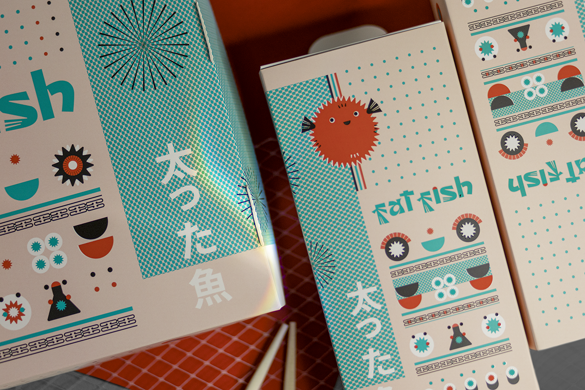
Graphic system
The basis of the graphic branding system is a pattern and a module.
The elements of the pattern are stylized forms (elements of Japanese traditional ornaments and more contextual images). All forms are interconnected and can be variantly mixed in a flexible system based on a modular grid.
All graphic elements are a logical extension and complement of the logo and character, which was designed to add empathy to the strict pattern system. The character is a funny fat fish used in visual communication.
Moodboard
Logo lettering
The lettering for the logo was created as the main connotative contrasting element, which is the basis for the subsequent modulation of the pattern and graphic system.
Graphic system
The elements of the pattern are stylized forms (elements of Japanese traditional ornaments and more contextual images). All forms are interconnected and can be variantly mixed in a flexible system based on a modular grid.
All graphic elements are a logical extension and complement of the logo and character, which was designed to add empathy to the strict pattern system. The character is a funny fat fish used in visual communication.
The basis of the graphic branding system is a pattern and a module.
Graphic system
The basis of the graphic branding system is a pattern and a module.
The elements of the pattern are stylized forms (elements of Japanese traditional ornaments and more contextual images). All forms are interconnected and can be variantly mixed in a flexible system based on a modular grid.
All graphic elements are a logical extension and complement of the logo and character, which was designed to add empathy to the strict pattern system. The character is a funny fat fish used in visual communication.
Color and texture
To modernize the identity and connect it with street culture, a contrasting minimalist combination of black, white and red-orange colors was used. A typographic pattern is used as the texture component.
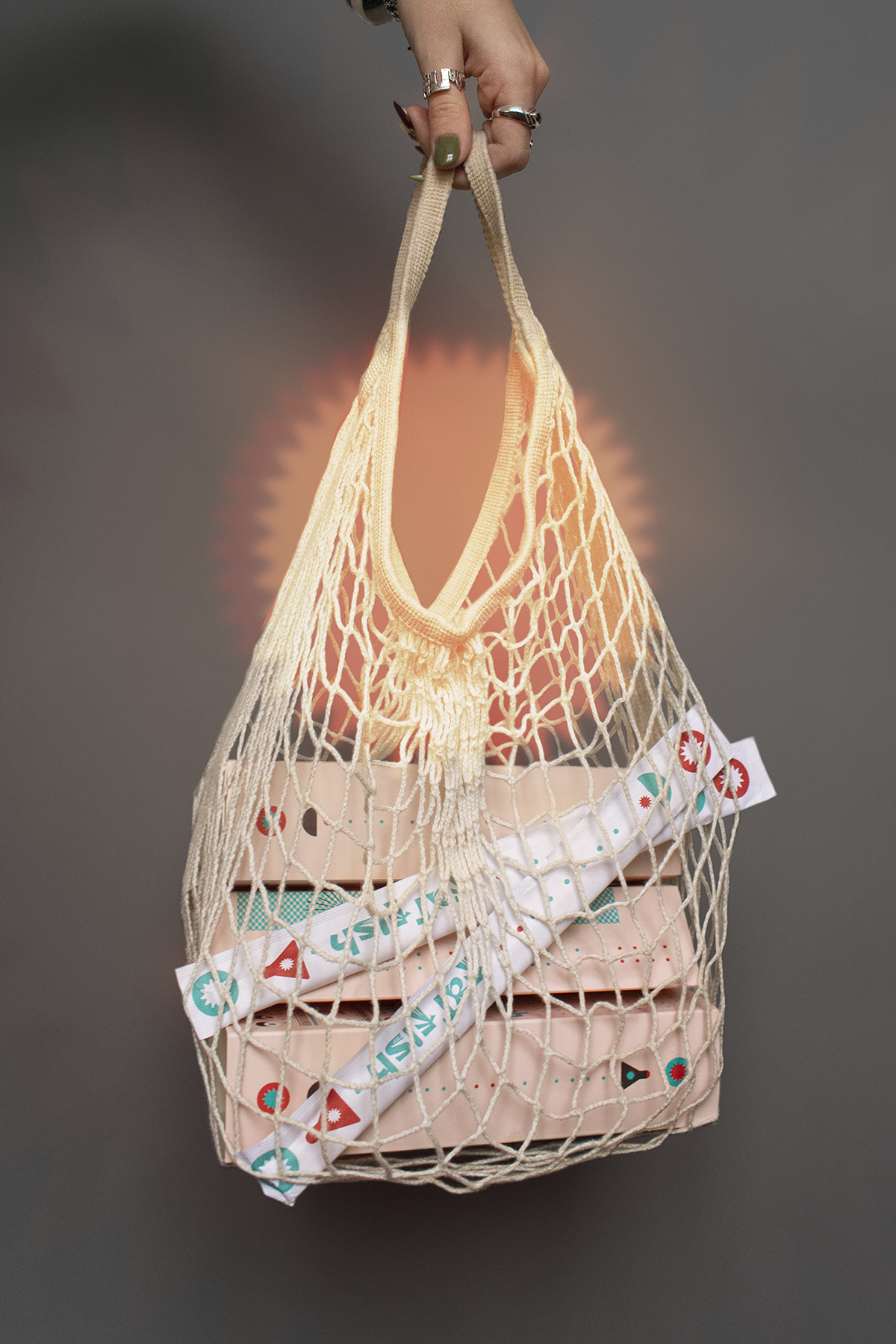
Interacting with the Real World
Fat Fish is a delivery service, the main visual communication with potential audiences and loyal customers is through packaging and booking the delivery process. The templates for social media marketing have also been developed.
Direct color connotations were used to simplify visual communication. These are the colors of the sea, red fish, and dark seaweed. The textures are a mix of modular graphics and visual metaphors. In addition, the pattern of graphic elements itself is texture and enhances the materiality of the design.
Color and texture
Color and texture
Direct color connotations were used to simplify visual communication. These are the colors of the sea, red fish, and dark seaweed. The textures are a mix of modular graphics and visual metaphors. In addition, the pattern of graphic elements itself is texture and enhances the materiality of the design.
Interacting with the Real World
Fat Fish is a delivery service, the main visual communication with potential audiences and loyal customers is through packaging and booking the delivery process. The templates for social media marketing have also been developed.
Fat Fish is a delivery service, the main visual communication with potential audiences and loyal customers is through packaging and booking the delivery process. The templates for social media marketing have also been developed.
Interacting with the Real World
Color and texture
Direct color connotations were used to simplify visual communication. These are the colors of the sea, red fish, and dark seaweed. The textures are a mix of modular graphics and visual metaphors. In addition, the pattern of graphic elements itself is texture and enhances the materiality of the design.
Interacting with the Real World
Fat Fish is a delivery service, the main visual communication with potential audiences and loyal customers is through packaging and booking the delivery process. The templates for social media marketing have also been developed.
This project was created by me as part of a work with the Plai Buro
Want to work together?
If you like what you see and want to work together, get in touch!