concept developing, graphic design, art direction, logo lettering, visual communication
Katsu Sando – Japanese street food
concept developing, graphic design, art direction, logo lettering, visual communication
Project Overview
Katsu Sando is a restaurant of Japanese street food.
My Contributions
I have worked on this project as an art director and design lead, as well as a font and graphic designer.
I conducted research and developed the project concept, created the logotype, graphic elements, design system and marketing materials. I also did art directing of the illustrations.
Katsu Sando – Japanese street food
concept developing, graphic design, packaging design, art direction, logo font design, visual communication
Katsu Sando – Japanese street food
concept developing, graphic design, art direction, logo lettering, visual communication
Project Overview
My Contributions
Katsu Sando is a restaurant of Japanese street food.
I have worked on this project as an art director and design lead, as well as a font and graphic designer.
I conducted research and developed the project concept, created the logotype, graphic elements, design system and marketing materials. I also did art directing of the illustrations.
Task and Solution
Katsu Sando is the name of a sandwich typical of Japanese street food. The main task in this project was to give the identity a character of modern Japan, but adapted for the European target audience, for which such food is not typical. The client wanted the identity, including the logo and character, to be very dynamic and a bit crazy.
Researching traditional and contemporary Japanese graphics and cultural phenomena, I was inspired in my design work by the aesthetic of the urban environment of modern Tokyo, a place that is always on the move and where incompatible parts (from a European perspective) go hand in hand.
Task and Solution
Moodboard
The basis of Katsu Sando's corporate identity is the font logo, for the creation of which I made a Latinization of modern Japanese font styles. The logo is flexible and adaptable and can be adapted to any medium without loss of recognition.
Logo Lettering
Task and Solution
Katsu Sando is the name of a sandwich typical of Japanese street food. The main task in this project was to give the identity a character of modern Japan, but adapted for the European target audience, for which such food is not typical. The client wanted the identity, including the logo and character, to be very dynamic and a bit crazy.
Researching traditional and contemporary Japanese graphics and cultural phenomena, I was inspired in my design work by the aesthetic of the urban environment of modern Tokyo, a place that is always on the move and where incompatible parts (from a European perspective) go hand in hand.
Task and Solution
Katsu Sando is the name of a sandwich typical of Japanese street food. The main task in this project was to give the identity a character of modern Japan, but adapted for the European target audience, for which such food is not typical. The client wanted the identity, including the logo and character, to be very dynamic and a bit crazy.
Researching traditional and contemporary Japanese graphics and cultural phenomena, I was inspired in my design work by the aesthetic of the urban environment of modern Tokyo, a place that is always on the move and where incompatible parts (from a European perspective) go hand in hand.
Moodboard
Moodboard
Logo Lettering
The basis of Katsu Sando's corporate identity is the font logo, for the creation of which I made a Latinization of modern Japanese font styles. The logo is flexible and adaptable and can be adapted to any medium without loss of recognition.
Logo lettering
The basis of Katsu Sando's corporate identity is the font logo, for the creation of which I made a Latinization of modern Japanese font styles. The logo is flexible and adaptable and can be adapted to any medium without loss of recognition.
Graphic system
The logo is adapted to the layout, and this creates the basis for an identity.
We have used phenomena and techniques typical of Japanese visual pop culture, such as manga, language mixing, complex typography, the ubiquitous mascot — and successfully created a dynamic and vibrant identity based on them. Katsu The Cat was created as a brand character and became the hero of the illustrations. The prototype of the character was my voracious and harmful cat Peanut.
Moodboard
Logo lettering
The basis of Katsu Sando's corporate identity is the font logo, for the creation of which I made a Latinization of modern Japanese font styles. The logo is flexible and adaptable and can be adapted to any medium without loss of recognition.
Graphic system
We have used phenomena and techniques typical of Japanese visual pop culture, such as manga, language mixing, complex typography, the ubiquitous mascot — and successfully created a dynamic and vibrant identity based on them. Katsu The Cat was created as a brand character and became the hero of the illustrations. The prototype of the character was my voracious and harmful cat Peanut.
The logo is adapted to the layout, and this creates the basis for an identity.
Color and texture
The color scheme is neon magenta and yellow. A bold color combination supports the bright and character of the brand.
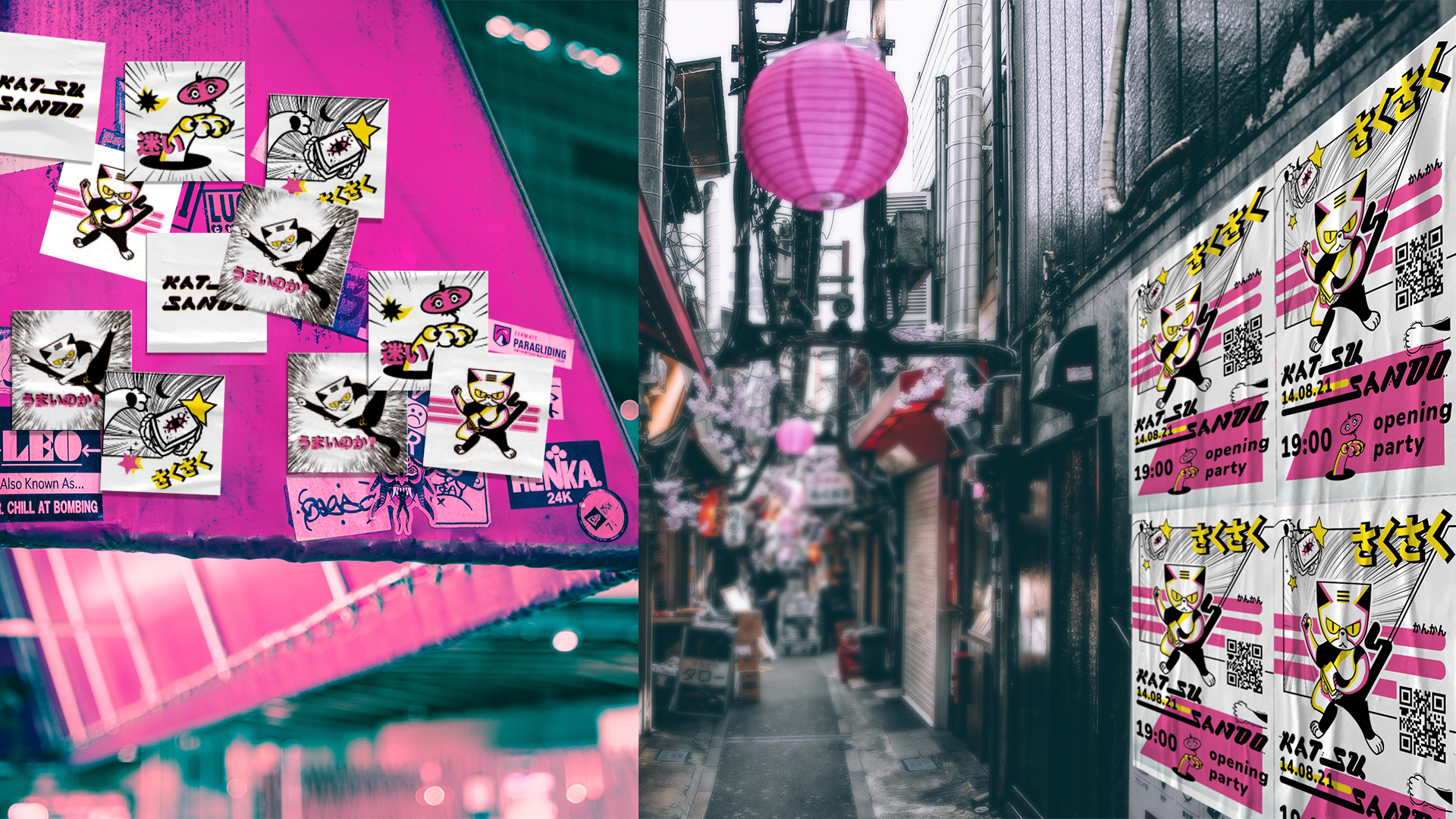
Interacting with the Real World
Katsu Sando is part of the urban environment, the brand uses posters, stickers, and even stenciling.
This decision is due to the fact that the young brand aims to become part of the urban culture in its multicultural area, where there are always many tourists and connoisseurs of good street food.
The color scheme is neon magenta and yellow. A bold color combination supports the bright and character of the brand.
Color and texture
Color and texture
The color scheme is neon magenta and yellow. A bold color combination supports the bright and character of the brand.
Interacting with the Real World
Katsu Sando is part of the urban environment, the brand uses posters, stickers, and even stenciling.
This decision is due to the fact that the young brand aims to become part of the urban culture in its multicultural area, where there are always many tourists and connoisseurs of good street food.
Katsu Sando is part of the urban environment, the brand uses posters, stickers, and even stenciling.
This decision is due to the fact that the young brand aims to become part of the urban culture in its multicultural area, where there are always many tourists and connoisseurs of good street food.
Interacting with the Real World
Color and texture
The color scheme is neon magenta and yellow. A bold color combination supports the bright and character of the brand.
Interacting with the Real World
Katsu Sando is part of the urban environment, the brand uses posters, stickers, and even stenciling.
This decision is due to the fact that the young brand aims to become part of the urban culture in its multicultural area, where there are always many tourists and connoisseurs of good street food.
This project was created by me as part of a work with the Plai Buro
Want to work together?
If you like what you see and want to work together, get in touch!