concept developing, graphic design, art direction, logo font design, packaging design, visual communication
White Wood Flowers
concept developing, graphic design, art direction, logo font design, packaging design, visual communication
Project Overview
Whitewood is a local florist design studio that creates floral arrangements to embellish everyday life. Whitewood is a team of professionals who turn special occasions into unforgettable experiences. The studio is located in Washington, D.C.
My Contributions
I have worked on this project as an art director and design lead, as well as a font and graphic designer.
I conducted research and developed the project concept, created the logotype, graphic elements and marketing materials development.
White Wood Flowers
concept developing, graphic design, art direction, logo font design, visual communication
White Wood Flowers
concept developing, graphic design, art direction, logo font design, packaging design, visual communication
Project Overview
My Contributions
Whitewood is a local florist design studio that creates floral arrangements to embellish everyday life. Whitewood is a team of professionals who turn special occasions into unforgettable experiences. The studio is located in Washington, D.C.
I have worked on this project as an art director and design lead, as well as a font and graphic designer.
I conducted research and developed the project concept, created the logotype, graphic elements and marketing materials development.
Task and Solution
In this case, the brand founder considers the mission of the White Wood Flowers to be a thoughtful, non-utilitarian approach to floral design. It's not just a business, but a craft and an art. The studio's florists practice an individualized approach in working with each client, empathizing with personal needs. The studio seeks to develop partnerships with local flower farms in Virginia and Maryland to highlight and promote the beauty of local nature. Branding for White Wood Flowers should help in productive communication not only with clients, but also with local restaurants, stores, hotels and fresh markets.
In addition Whitewood Flowers does business with exclusively high-end flowers imported from Holland, Ecuador, and Thailand. The studio's team includes only high level florists, masters and fans of their profession.
Thus, branding should reflect: elitism, traditions of craftsmanship, deep immersion in the art of floristry. In addition, an important task was to create branding that would not detract from the flowers and floral arrangements. The design had to be recognizable, but fit in with the natural beauty without overwhelming it.
So I decided to create a visual story about centuries-old traditions and craftsmanship pride. For inspiration, I decided to turn to the aesthetics of the golden age of craftsmanship culture development. In the 17th century, each shop (Corporation) had its own heraldic symbol and code of honor. To guarantee a high quality product for consumers, only an experienced and skilled craftsman could belong to the workshop. In addition, it was necessary to add connotations to botanical science in order to solve the problem. The design solution had to tell a story without taking up too much attention and space, to suit different styles of floral design. Therefore, all these historical references and connotations were added to the logo font and the symbol without the use of illustrations or excessive decorative elements.
Task and Solution
Moodboard
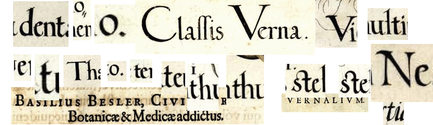
Logo lettering inspired by prints from The Hortus Eystettensis. Hortus Eystettensis is a codex produced by Basilius Besler in 1613. This book changed botanical art. This was the beginning of the aesthetic approach to the depiction of plants and floristry. The peculiarity of this type specimen is that it is an engraving, not a metal typesetting typeface. All letters came out from under the hand of the master like flowers, they are a little different, but each one is beautiful. I analyzed the samples and created a lettering based on them.
Logo Lettering
Task and Solution
At first it was a young business that needed to distinguish itself from the competition and make a statement about itself, its experience, and its right to exist in the big city.
Although the restaurant had unique dishes and offerings, the communication used the same style of other Asian restaurants, and the visual image was vague and unrecognizable. Also the father of the brand, the chef, wanted to use the image of a bear in the brand identity. The image of the bear had to have the freedom and sincerity inherent in the spirit of the place.
To see where to start, I turned to the phenomenon of Asian street food in America and Europe. The Western consumer also contributed to the taste and appearance of Asian food. It became less spicy, more colorful in appearance, but remaine quite cheap. Hence the decision to be inspired by the traditional graphics of different Asian countries, which share a deep connection with Buddhist culture. And then to complement and update the visual style with elements of Western street culture.
Task and Solution
In this case, the brand founder considers the mission of the White Wood Flowers to be a thoughtful, non-utilitarian approach to floral design. It's not just a business, but a craft and an art. The studio's florists practice an individualized approach in working with each client, empathizing with personal needs.
The studio seeks to develop partnerships with local flower farms in Virginia and Maryland to highlight and promote the beauty of local nature. Branding for White Wood Flowers should help in productive communication not only with clients, but also with local restaurants, stores, hotels and fresh markets.
In addition Whitewood Flowers does business with exclusively high-end flowers imported from Holland, Ecuador, and Thailand. The studio's team includes only high level florists, masters and fans of their profession.
Thus, branding should reflect: elitism, traditions of craftsmanship, deep immersion in the art of floristry. In addition, an important task was to create branding that would not detract from the flowers and floral arrangements. The design had to be recognizable, but fit in with the natural beauty without overwhelming it.
So I decided to create a visual story about centuries-old traditions and craftsmanship pride. For inspiration, I decided to turn to the aesthetics of the golden age of craftsmanship culture development. In the 17th century, each shop (Corporation) had its own heraldic symbol and code of honor. To guarantee a high quality product for consumers, only an experienced and skilled craftsman could belong to the workshop. In addition, it was necessary to add connotations to botanical science in order to solve the problem. The design solution had to tell a story without taking up too much attention and space, to suit different styles of floral design. Therefore, all these historical references and connotations were added to the logo font and the symbol without the use of illustrations or excessive decorative elements.
Moodboard
Moodboard
Logo Lettering
Logo lettering inspired by prints from The Hortus Eystettensis. Hortus Eystettensis is a codex produced by Basilius Besler in 1613. This book changed botanical art. This was the beginning of the aesthetic approach to the depiction of plants and floristry. The peculiarity of this type specimen is that it is an engraving, not a metal typesetting typeface. All letters came out from under the hand of the master like flowers, they are a little different, but each one is beautiful. I analyzed the samples and created a lettering based on them.
Logo lettering
The lettering for the logo was created as the main connotative contrasting element, which is the basis for the subsequent modulation of the pattern and graphic system.
Symbol
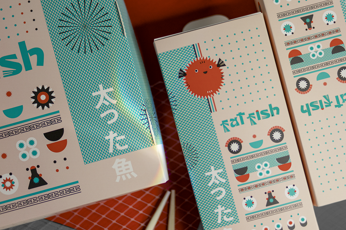
The brand symbol is an illustrated letter that combines the font style of the logo and stylized thistle flowers.
We and our customers analyzed the symbolism of different plant species in terms of the language of flowers and heraldry. We have chosen this wildflower because Thistle a symbol of resilience and beauty of nature.
Graphic system
The basis of the graphic branding system is a pattern and a module.
The elements of the pattern are stylized forms (elements of Japanese traditional ornaments and more contextual images). All forms are interconnected and can be variantly mixed in a flexible system based on a modular grid.
All graphic elements are a logical extension and complement of the logo and character, which was designed to add empathy to the strict pattern system. The character is a funny fat fish used in visual communication.
Moodboard
Logo lettering
Logo lettering inspired by prints from The Hortus Eystettensis. Hortus Eystettensis is a codex produced by Basilius Besler in 1613. This book changed botanical art. This was the beginning of the aesthetic approach to the depiction of plants and floristry. The peculiarity of this type specimen is that it is an engraving, not a metal typesetting typeface. All letters came out from under the hand of the master like flowers, they are a little different, but each one is beautiful. I analyzed the samples and created a lettering based on them.
Symbol
We and our customers analyzed the symbolism of different plant species in terms of the language of flowers and heraldry. We have chosen this wildflower because Thistle a symbol of resilience and beauty of nature.
The brand symbol is an illustrated letter that combines the font style of the logo and stylized thistle flowers.
Symbol
The brand symbol is an illustrated letter that combines the font style of the logo and stylized thistle flowers.
We and our customers analyzed the symbolism of different plant species in terms of the language of flowers and heraldry. We have chosen this wildflower because Thistle a symbol of resilience and beauty of nature.
Color and texture
To maximize branding compatibility with as many bouquet colors and floral designs as possible, we chose a complex shade of green, white, and as an additional accent color of gold. The texture of the branded materials is important, as close to natural as possible tactilely. Branded fabrics such as silk and satin are also used for special clients.
Interacting with the Real World
Since the main visual language of the brand is a work of art from fresh flowers, the brand identity is delicately tailored to the product, giving a refined and suitable for different styles and solutions from florists.
To maximize branding compatibility with as many bouquet colors and floral designs as possible, we chose a complex shade of green, white, and as an additional accent color of gold. The texture of the branded materials is important, as close to natural as possible tactilely. Branded fabrics such as silk and satin are also used for special clients.
Color and texture
Color and texture
To maximize branding compatibility with as many bouquet colors and floral designs as possible, we chose a complex shade of green, white, and as an additional accent color of gold. The texture of the branded materials is important, as close to natural as possible tactilely. Branded fabrics such as silk and satin are also used for special clients.
Interacting with the Real World
Since the main visual language of the brand is a work of art from fresh flowers, the brand identity is delicately tailored to the product, giving a refined and suitable for different styles and solutions from florists.
Since the main visual language of the brand is a work of art from fresh flowers, the brand identity is delicately tailored to the product, giving a refined and suitable for different styles and solutions from florists.
Interacting with the Real World
Color and texture
Direct color connotations were used to simplify visual communication. These are the colors of the sea, red fish, and dark seaweed. The textures are a mix of modular graphics and visual metaphors. In addition, the pattern of graphic elements itself is texture and enhances the materiality of the design.
Interacting with the Real World
Fat Fish is a delivery service, the main visual communication with potential audiences and loyal customers is through packaging and booking the delivery process. The templates for social media marketing have also been developed.
Want to work together?
If you like what you see and want to work together, get in touch!


-by-Creatsy%C2%AE-copy.png)