concept developing, graphic design, art direction, logo font design, visual communication
Prismatic
concept developing, graphic design, art direction, logo font design, visual communication
Project Overview
Prismatic is a consulting company that specializes in working with IT startups and helping young talented development teams to be financially successful.
My Contributions
I have worked on this project as an art director and design lead, as well as a font and graphic designer.
I conducted research and developed the project concept, created the logotype, graphic elements, design system and marketing materials.
Project Overview
Prismatic is a consulting company that specializes in working with IT startups and helping young talented development teams to be financially successful.
My Contributions
I have worked on this project as an art director and design lead, as well as a font and graphic designer.
I conducted research and developed the project concept, created the logotype, graphic elements, design system, and marketing materials.
Prismatic
concept developing, graphic design, art direction, logo font design, visual communication
Prismatic
concept developing, graphic design, art direction, logo font design, visual communication
Project Overview
My Contributions
Prismatic is a consulting company that specializes in working with IT startups and helping young talented development teams to be financially successful.
I have worked on this project as an art director and design lead, as well as a font and graphic designer.
I conducted research and developed the project concept, created the logotype, graphic elements, design system and marketing materials.
Project Overview
My Contributions
Prismatic is a consulting company that specializes in working with IT startups and helping young talented development teams to be financially successful.
I have worked on this project as an art director and design lead, as well as a font and graphic designer.
I conducted research and developed the project concept, created the logotype, graphic elements, design system, and marketing materials.
Task and Solution
The client's main challenge was to create visual communication with a young and tech-savvy audience. Therefore, the identity had to talk about services such as financial analysis and audit not in a boring voice, but be clear and flexible. The core brand values were defined as transparency, adaptability, modernity, intelligence.
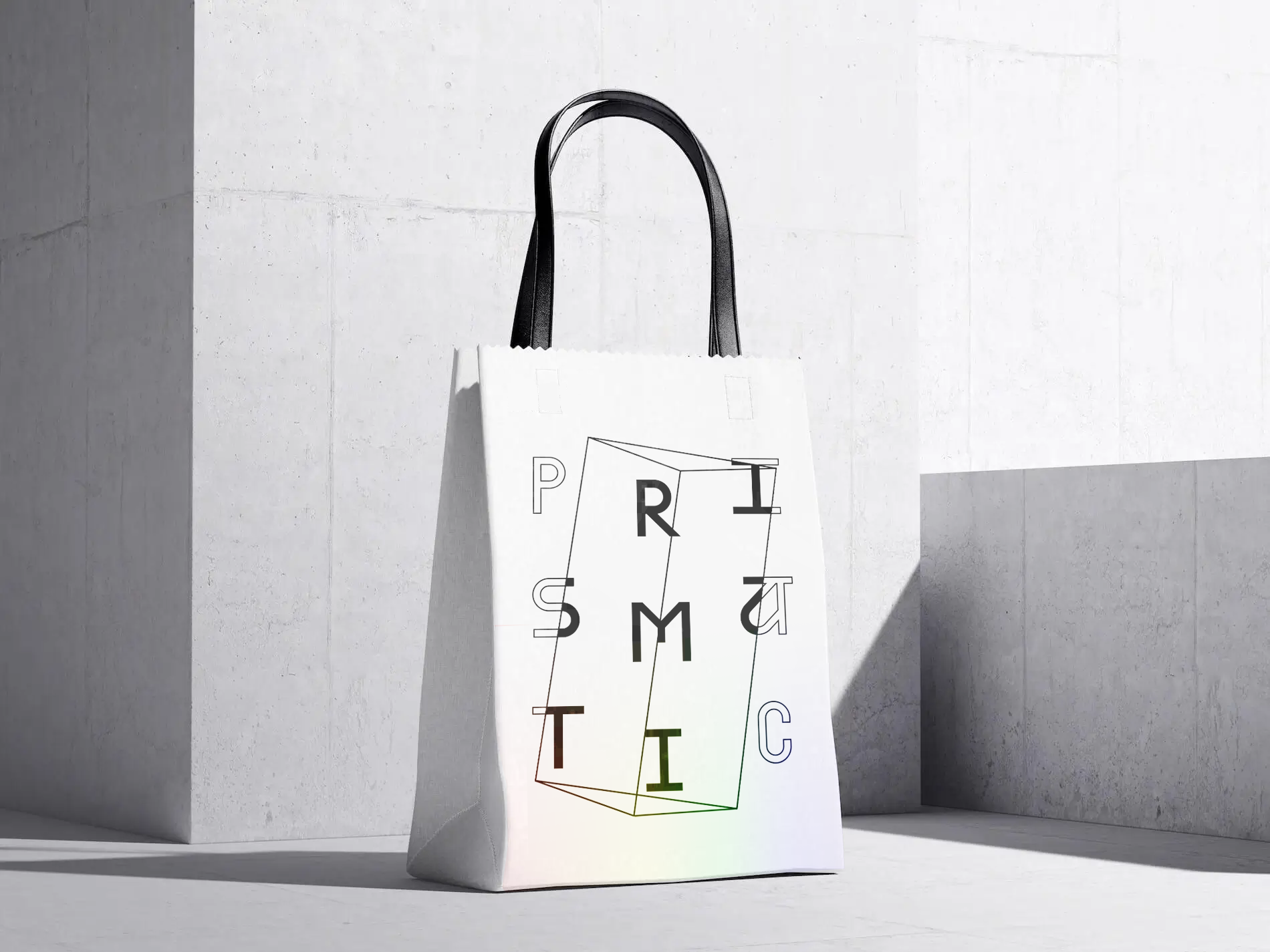
I used visuals from the exact sciences and econometrics to solve this problem. To better connect with the target audience, I decided to create a bright, modern image and add creative typography to the identity.
The main visual metaphor was a prism, showing transparency, focusing light and linking the visual style to the company's name.
The client's main challenge was to create visual communication with a young and tech-savvy audience. Therefore, the identity had to talk about services such as financial analysis and audit not in a boring voice, but be clear and flexible. The core brand values were defined as transparency, adaptability, modernity, intelligence.
I used visuals from the exact sciences and econometrics to solve this problem. To better connect with the target audience, I decided to create a bright, modern image and add creative typography to the identity.
The main visual metaphor was a prism, showing transparency, focusing light and linking the visual style to the company's name.
Task and Solution
Moodboard
The lettering for the logo is based on the classic modular sans-serif font grid using graphic display of polar coordinates to determine the resultant prism.
The font of the logo has elements characteristic of IT sphere and mathematical symbols.
Logo Lettering
Task and Solution
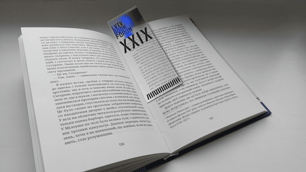
BookForum was held from October 6 to 9, 2022. But due to the full-scale invasion of Russia, organizers had to change the event format. Speakers, dignitaries, and journalists were broadcast from the bomb shelter. So instead of visiting live meetings, a lot of people could join online worldwide broadcasts. In addition to the new format, BookForum needed to create the brand identity of the festival so that the identity would reflect the reality of the war in Ukraine.
In accordance with this task, I did a research of the views and opinions of the target audience (publishers, authors and book lovers) in social networks, and also decided to add to the design connotations to Ukrainian culture and the country's struggle for independence.
Task and Solution
The client's main challenge was to create visual communication with a young and tech-savvy audience. Therefore, the identity had to talk about services such as financial analysis and audit not in a boring voice, but be clear and flexible. The core brand values were defined as transparency, adaptability, modernity, intelligence.
I used visuals from the exact sciences and econometrics to solve this problem. To better connect with the target audience, I decided to create a bright, modern image and add creative typography to the identity.
The main visual metaphor was a prism, showing transparency, focusing light and linking the visual style to the company's name.
Moodboard
Moodboard
Logo Lettering
The lettering for the logo is based on the classic modular sans-serif font grid using graphic display of polar coordinates to determine the resultant prism.
The font of the logo has elements characteristic of IT sphere and mathematical symbols.
Logo lettering
Lettering for the logo, with decorative elements that are traditional for the Ukrainian font style, was developed based on 25 equal modules, symbolically including 24 regions of Ukraine + Crimea in this concept.
I also developed a variant of the logo, where some letters seem to lose balance but at the same time safely rest on others. That is how I metaphorically tried to conveythe feeling of instability that is familiar to every Ukrainian today. That is a story about the search for the support we currently find in culture, particularly in books, texts, public conversations, and discussions. The font was made monospaced, paying tribute to the Ukrainian’ Samvydav’ era of the 60s. When authors did not have the opportunity to publish their works in their native language due to Soviet censorship, they printed them on their own. And then people secretly reprinted them on typewriters, where only such monospaced font was.
Graphic system
The basis of the design system was the creative typography of the logo in symbiosis with the prism. In turn, the prism is the basis for graphic elements (charts, diagrams, ui elements), which are used by clients.
The contrast of two-dimensional and three-dimensional elements, as well as lines and spots are used for greater visual expressiveness.
Graphic system
The functional elements of the identity are also built on the same modular principle as the font (a circle, books on a shelf, an anti-tank hedgehog) which form a complete design system. The designers also visually quoted BookForum’s partner, the British literary festivalHay Festival.
Separately, I would also like to elaborate on the graphic visualization of the anti-tank hedgehog. It is the main accent element that first catches the eye of the new corporate identity of the literary festival. At the beginning of the full-scale Russian aggression, people built and put that anti-tank hedgehogs on the roads to protect their cities and villages. So now hedgehog symbolizes resistance a big, bold, and bright one. It is an important image that reminds us at what cost we can hold a literary festival in times of full-scale war.
The Roman numerals that form the number 29 (as this BookForum is the 29th) are also built according to the same corporate identity font system.
Moodboard
Logo lettering
The lettering for the logo is based on the classic modular sans-serif font grid using graphic display of polar coordinates to determine the resultant prism.
The font of the logo has elements characteristic of IT sphere and mathematical symbols.
Graphic system
The basis of the design system was the creative typography of the logo in symbiosis with the prism. In turn, the prism is the basis for graphic elements (charts, diagrams, ui elements), which are used by clients.
The contrast of two-dimensional and three-dimensional elements, as well as lines and spots are used for greater visual expressiveness.
Graphic system
The basis of the design system was the creative typography of the logo in symbiosis with the prism. In turn, the prism is the basis for graphic elements (charts, diagrams, ui elements), which are used by clients.
The contrast of two-dimensional and three-dimensional elements, as well as lines and spots are used for greater visual expressiveness.
Symbol and color
The accent symbol for the identity is the Sigma /ˈsɪɡmə/ Σ, is the eighteenth letter of the Greek alphabet. This symbol is used to represent a sum in higher mathematics and econometrics. The sign is a projection of the central letterform of the logofont.
Since the main visual anchor in the identity is creative typography and pure white light, I used the spectrum as a soft additional design element to complement the prism image.
Interacting with the Real World
The identity is used flexibly in both traditional consulting and audit marketing materials as well as in the familiar digital environment of the target audience.
The accent symbol for the identity is the Sigma /ˈsɪɡmə/ Σ, is the eighteenth letter of the Greek alphabet. This symbol is used to represent a sum in higher mathematics and econometrics. The sign is a projection of the central letterform of the logofont.
Since the main visual anchor in the identity is creative typography and pure white light, I used the spectrum as a soft additional design element to complement the prism image.
Symbol and color
Symbol and Color
The accent symbol for the identity is the Sigma /ˈsɪɡmə/ Σ, is the eighteenth letter of the Greek alphabet. This symbol is used to represent a sum in higher mathematics and econometrics. The sign is a projection of the central letterform of the logofont.
Since the main visual anchor in the identity is creative typography and pure white light, I used the spectrum as a soft additional design element to complement the prism image.
Interacting with the Real World
The identity is used flexibly in both traditional consulting and audit marketing materials as well as in the familiar digital environment of the target audience.
The identity is used flexibly in both traditional consulting and audit marketing materials as well as in the familiar digital environment of the target audience.
Interacting with the Real World
Color and texture
Gradient blue is the main color. It represents the image of a clear sky, which is obscured by smoke (a gray texture on the identity) after yet another missile strike or coming from Ukrainian books burned by the occupiers. Yet, at the same time, this very blue carries a bit of sacredness, symbolizing heavenly light and a sense of cleansing from filth – read: from Russians on our lands. The textures co-exist together, but the blue is trying to break out of the smoky gray texture, so it dominates.
Interacting with the Real World
BookForum’s identity does not exist in a vacuum but interacts with the world. It’s not just posters or social media visuals. It’s an authentic interaction, augmented reality, if you will. On some mediums, for example, instead of a blue tone, we integrate the real sky. Or we use tape on the windows in visualization, which, unfortunately, has already become a standard part of Ukrainian life. Every Ukrainian sealed his windows at home to protect them from breaking after the explosion. Even the trains and buses have their windows sealed with tape. Thus, with the help of visual language, we tried to explain to the world community what and why is happening in Ukraine now.
Want to work together?
If you like what you see and want to work together, get in touch!


%20Poster%2001%20copy.png)


%20Box%20Tape%20copy.png)

